USABILITY TEST
Dane County Humane Society Usability Test
Conducting usability test on Dane County Humane Society's website.

PROJECT OVERVIEW
What is Dane County Humane Society?
“Provides refuge, healing, and new beginnings to thousands of companion animals, exotic species, farm animals, and injured or orphaned wild animals every year.”
- Dane County Humane Society
PAIN POINT
Hard to find information in the website clearly and quickly.
USERS
Residents in Madison, WI who are interested in animal-related issues.
GOALS
Optimize the website to raise the communication efficency.
DURATION
3 months (Sept 2023 - Dec 2023)
UW-Madison, Course Project
MY ROLE
User Research
INTRODUCTION
What is the main service of Dane County Humane Society?


USER
Target User
People who lives in Madison, WI and are interested in animal-related topics or have pets.
Demographics:
• Living Area: Madison, WI
Behaviors:
• Interested in animal-related topics
USER
Recruiting Participants
Those target users should be interested in having a pet or currently own one and willing to use the service on the website.
Recruiting Method
Interest Group – Facebook club of cat owners.
Friends and Family – Social Media.
Participants Summary
-
27 years old, Male / Data Analysis living in Madison, working hybrid
-
25 years old, Female / Master Student in Education at UW-Madison
-
24 years old, Female / PhD Student in Economics at UW-Madison
-
20 years old, Male / Undergrad Student in Mathematic at UW-Madison
-
28 years old, Male / Product Designer working remotely in Madison
METHOD
How do I approach to the goal?
RESEARCH QUESTIONS
To reach the goal of optimizing the website to enhance its communication efficiency between the staff of humane society and users, I have 3 research questions.
RESEARCH QUESTION #1
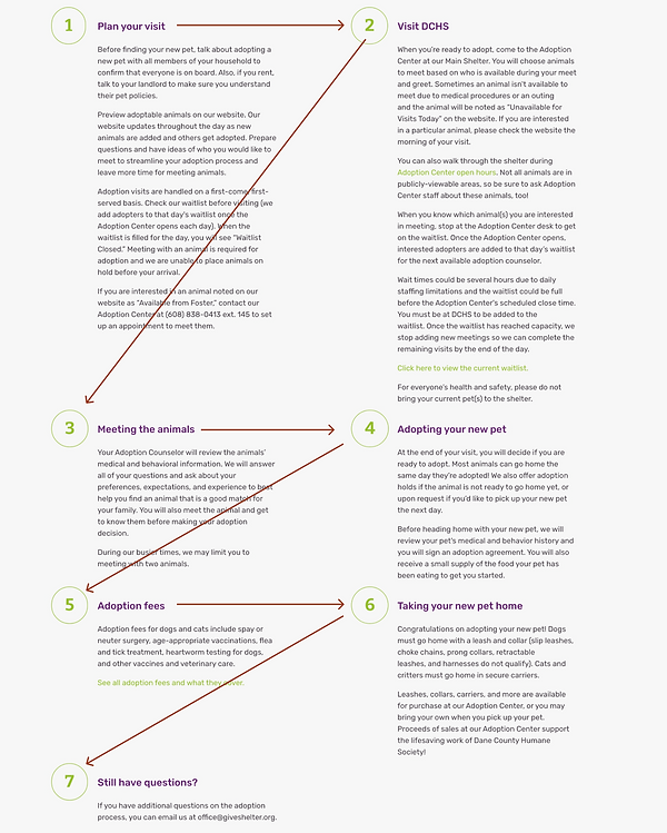
What issues do users face when checking the adoption process online?
By understanding the problems that the users face, we may know what we need to do to optimize the user experience when navigating to enhance the adoption process and raise the adoption rate for people coming through the website.
RESEARCH QUESTION #2
What challenges do users face when finding their lost pet on the website?
We could understand what tasks people prioritize and how they report when losing their pets. Therefore, we can modify the lost and found feature on the website to make the whole process smoother and quicker for people to report and search for their pets as soon as possible.
RESEARCH QUESTION #3
How efficient is it for users to report rescued animals on the site
By understanding the procedure people take when rescuing an animal, we can modify the website to make it more usable and enable users to report and find the correct process.
DESIGNED TASKS
Then, to answer the research question, I designed 3 tasks for the participants to test.
Task #1
Search and adopt a pet that you like on the website.
Scenario: You plan to adopt a pet from the Dane County Humane Society. Search for a pet they like the best and schedule an adoption on the website to complete the task.
Task #2
Search and report a lost animal on the website.
Scenario: You lost your pets and should use the website to report and search for your pets.
Task #3
Report a rescue animal you picked on the website.
Scenario: You pick an injured stray cat in downtown Madison near Capital, and you need to seek resources and assistance to deal with the animal.
RESULT
These are the findings.
TASK SUCCESS RATE & TIME ON TASK

ISSUE
Poor navigation that confuse the users.
-
Participants Encountered: 4/5
-
Severity: 4 (Out of 5)
Users spend much time scanning through every label, but still can’t see the exact information they need.
DESIGN IMPLICATION
Group the menu list into more minor groups.

ISSUE
Confusing information architecture.
-
Participants Encountered: 5/5
-
Severity: 4 (Out of 5)
Influenced by the various action button and text links, users are not aware that they have reached toward the end of the page.
DESIGN IMPLICATION
Remove the various action button and leave the most critical one.

ISSUE
Too much information in one page.
-
Participants Encountered: 5/5
-
Severity: 3 (Out of 5)
The wordy contents let the users to oversee the important details.
DESIGN IMPLICATION
Concise the content text on the page to lower word count, and add more subtitle to make the structure clearer.

ISSUE
Poor visual hierarchy made the users hard to read.
-
Participants Encountered: 3/5
-
Severity: 2 (Out of 5)
The Z shape of reading is not intuitive for users.
DESIGN IMPLICATION
Change the layout from Z shape to top-to-bottom style.
NEXT STEPS & KEY TAKEAWAYS
NEXT STEPS
Since this is a course project, I cannot see how it is implemented in the real world to gather further data and start the redesign process. My next step would be starting the redesign process and doing usability testing to see whether it helps solve the problem or not.
KEY TAKEAWAYS
-
Recruiting the testers is the most challenging part. How to collect the right and target users is a big challenge that I face when recruiting.
-
Visual design is also crucial in website design. Aside from the navigation, content, and information hierarchy in the website, many users are also confused by the visual hierarchy and design and couldn't find important information.
-
Being neutral during the usability test is very important. If I show any emotion or bias in the usability testing, it will influence the testing result and couldn't reflect the most realistic problem that the user face.


