UX RESEARCH / UX DESIGN
UW-Madison Athletic App Redesign
Conducting UX research and UX design on the redesigning of Wisconsin Badger's mobile application.

PROJECT OVERVIEW
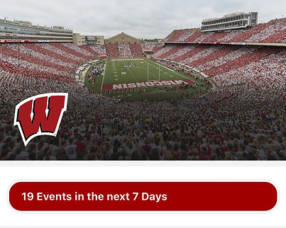
What is Wisconsin Badger App?
Wisconsin Badgers is an athletic app for UW-Madison that enable students, faculties, and guests to purchase sports ticket online. Besides, users can also see the future schedule of matches and watch live on their mobile.
PAIN POINT
Difficulties in finding the correct information can frustrate the users to discourage revisit.
USERS
The users are mainly UW-Madison's students and faculties.
GOALS
Give users straightforward information about the ticket and easy access to book the ticket.
DURATION
4 months, UW-Madison, Course Project
MY ROLE
Research, Ideation, Prototype, Visual Design

How it all get started...
BACKGROUND
It was an evening after my friends and I watched our first Badger's football game on the television.
"How about booking a ticket to see the game in the stadium?"
"Nice idea...Wait, can you find the booking button?"
At first, we thought we could finish the booking within the advertisement time. It ended up taking a laptop to complete our booking without our mobile.
This was the start of the redesign project...
PROCESS
How I go through my way to the goal.
Following the design thinking process, I walked through the design process to redesign the application. This is not a linear process. Instead, every step is repeated and looped to continue modifying the design.
UNDERSTAND
EMPHASIZE
DEFINE
EXPLORE
IDEATE
PROTOTYPE
MATERIALZE
TEST
User Interview
Contexual Inquiry
Affinity Map
HMW Statememts
Brainstrom
Story Board
Task Flow
Paper Prototype
Wireframes
High-Fidelity Prototype
Heurisitc Evaluation
USER RSEARCH
What is the buisness value and user painpoints?
To create positive user experiences, involving actual users in the design process is essential. Therefore, I used the following two methods to collect both the STORY and the BEHAVIOR of the users to understand their experience when booking a ticket through the mobile app.
INTERVIEW
I use interviews as the first method to get early information about users' thoughts, beliefs, mental models, and experiences. I interviewed six current UW-Madison students by asking a list of 10 questions through one-on-one conversations to obtain direct quotes and insights.
Goals
To learn about the user’s ticket-purchasing experience.
-
What is the purchasing process and medium that users are accustomed to when booking Wisconsin Badger's tickets?
-
What reasons influence users to use specific mediums for purchasing tickets?
-
What is the experience of users purchasing tickets through these methods?
INTERVIEW INSIGHT #1
People tend use online methods to purchase tickets.
6 out of 6 people use online methods, such as a mobile app or laptop, to purchase tickets. Online buying a ticket makes it more convenient to choose a seat and arrange the schedule.
INTERVIEW INSIGHT #2
Mobile is the most used medium when purchasing tickets.
Among the online strategies, 5 out of 6 people use mobile phones to book tickets through applications or websites. It is more convenient, and you can buy the ticket anytime, anywhere. The only person who does not use mobile is because the current website and mobile application is too hard to book a ticket.
INTERVIEW INSIGHT #3
Most steps on the mobile application or website are confusing.
All participants mentioned the bad navigation and the issue of looping pages on the mobile. It is hard for them to find the information easily on the application.
INTERVIEW INSIGHT #4
Most people only use the application and website for booking ticket.
Since it is hard to watch live video and audio on the app, all participants mentioned that they only used the app to purchase tickets and search for schedules. 2 out of 6 participants even do not know there is news and live audio functions in the application.
CONTEXTUAL INQUIRY
Last, I conducted a contextual inquiry with four users to understand more about the context in which the user is booking tickets. When multiple users encounter similar or identical pain points, special attention can be brought to this, and further data can be collected.
I asked the participants to think out loud as they showed us the process they undertook when booking a ticket so that I could highlight the emotions users feel, especially when encountering common pain points.
Goals
-
What are the common breakdowns users encountered when purchasing the tickets?
-
What are the emotion route when users use the mobile to book ticket?
Here's what I found.
CONTEXTUAL INQUIRY INSIGHT #1
People cannot find where to purchase the ticket.
Redundant buttons confuse the users when finding where to book the ticket.
CONTEXTUAL INQUIRY INSIGHT #3
Too much information on site.
Many external links were built inside the app, which caused lots of pop-out windows to open that interrupted the browsing experience.
CONTEXTUAL INQUIRY INSIGHT #2
The labels are not clear and consistency.
Labels in the application are not clear and confuse the users when navigating.
CONTEXTUAL INQUIRY INSIGHT #4
The navigation is terrible. Due to the high pop-out windows, users got lost in the application and had to return to the home page to search for tickets again.
Users are lost in the application.
DEFINE PROBLEM STATEMENT
How can I merge the collected findings?
Then, to identify user needs and insights that will guide our future design, I used the "Affinity Diagram" to interpret the data and give out the How-Might-We (HMW) statement.
AFFINITY DIAGRAM
Due to the massive data collected, I brainstormed to form an affinity diagram to transcript the data and cluster them into several groups to distill the key points.

What Users Need.
Users need a way to
book a ticket easily,
because they want to finish the booking conveniently.
Users need a way to
notice the sports schedule quickly
because they want to know the latest events.
Users need a way to
have clear navigation
so they can find discounts and jump out of the loop of the purchasing process.
HMW STATEMENT
"How might we…
enable the users to see clear information of the ticket and have easy access to book the ticket, so they can ensure that they have booked the desired tickets."
IDEATION
How can I find out the best practice for solution?
After finding the right problem, it is time to design the right solution.
I ran through brainstorming, storyboarding, and task flow to generate a new design for the application to meet the user's needs.
I created the solution in three stages.
Brainstorming for wild ideas:
Brainstorming for 25 ideas then cluster them into groups.
Working on viable options:
Select possible solutions and build up story board, task flow, wireframes, and prototypes.
Polish the prototype:
Test the prototype and merge the possible design together.
BRAINSTORMING
Generating various wild ideas often leads to better designs than if you made sure that all of the ideas were practical from the start.
After generating about 25 solutions, I clustered them into groups and mashups and selected the three most possible solutions to move on to.
Select Solutions
-
Adding breadcrumbs navigation to show where/which step the users are now.
-
Put the search or filter feature on the first landing page.
-
Put a description in “read more” and leave only the important information in the main page.

STORYBOARD
Next, to see how the design solution would influence users' daily scenario, I sketched through the storyboard of people purchasing the ticket to show how the design should meet the user's need. In the storyboard, the user can quickly book the ticket during the advertising time of the game, which perfectly match the HMW statement: to provide a easy and quick way to book ticket.
"How might we… enable the users to see clear information of the ticket and has easy access to book the ticket, so they can ensure that they have booked the desired tickets."


TASK FLOWS
Based on the insights gained from the initial content audits, I determined the information architecture and the app's navigation. I defined five task flows for the key tasks, including searching for tickets, booking tickets, managing tickets, browsing game schedules, and watching games online.


Design Ideas
Enable the app to show clear navigation and allow users to complete each task quickly.
-
Mostly complete every task within one page.
-
Place the most common use function below as the navigation bar.
Navigation Model
-
Fully Connected: All pages are connected with direct links to one other.
This app has different functions that are linked to each other. In this way, the users do not need to jump out of the page to do other functions, but they can easily access the same functions in several paths.
WIREFRAME & PROTOTYPE
Since there are many tasks to be done, to prioritize the tasks and narrow down the scope of the project, I went back to the user needs:
Accroding to the HMW statement, I pick the three major tasks: Search for tickets, Book tickets, and Manage Tickets.
I then developed a series of prototypes of the application, from low-fidelity wireframe to high-fidelity to see how the design idea could fix the issues.
"How might we… enable the users to see clear information of the ticket and has easy access to book the ticket, so they can ensure that they have booked the desired tickets."
SCREEN DESIGN - SKETCH
I took the task flow as a fundamental, I then developed a more detailed screen design to see whether I was missing any elements on the screen.
Visual Design Goal
-
The navigation should show clear information, so the user can easily find information and navigate where they are.
-
The color should be similar to the color palette of UW-Madison so that users will feel connected to the Badgers.
-
The sections and typography should be designed modern to make users feel that the application is updating to the latest trends.
-
The design should emphasize booking and searching for tickets so that people will use the application frequently.
-
The whole information should enable users to click less to see the important information they want.


PAPER PROTOTYPE
To test the scenerio of searching and booking, I developed a low-fidelity paper prototypes. The planned task and general structure of the application could easily be tested in usability tests before moving on to building digital wireframe.


Me introducing the scenerio to Ameya (black jacket), Sindhu (blue clothes) and John (white hoodie).
Usability Test
I conducted a usability test to determine whether the new design would solve their problems. I created a scenario of purchasing the ticket and asked the users to think out loud while they executed it.
During the session, I observed the three testers--John (Taiwanese, 24), Ameya (Indian, 23), and Sindhu (Indian, 25)--interact with the prototype. The three of them completed the task successfully but still encountered minor problems and hesitation when doing the job.
Breakdowns
-
Too much information on the page caused them not to be sure what to click next to select their section and seat.
-
They cannot find the “check out” button when deciding the number of tickets.

Ameya is testing paper prototypes.
Revise
According to the feedback and breakdowns that I observed while doing the usability test, I redesigned and modified some UI elements on the page and added more indicators on the screen to enable the whole process clearer.
WIREFRAME
Next, I digitalize the wireframe to add more interaction and see how it looks on the screen. Digitalizing the wireframe helps me focus on visual hierarchy and information architecture before I make decisions about fonts, colors, and graphics. I went back to the HMW statement again to see whether I missed anything!
Some UI elements are added to solve the user's pain points:
-
User needs a clear navigation: Search Bar / Filter
-
User needs a clean and simple page: Only put important information / Read More button
-
User needs an easy access to purchase tickets: Shortcuts to purchase tickets


HIGH-FIDELITY MOCKUPS & INTERACTIVE PROTOTYPE
Last, after another usability test after the wireframe, I continued to modify the prototype and add more interactions to see how the UI elements would interact with the users. At this stage, I develop the design guideline and design kit for the final product to see finalize its appearance.


For the color palette, to provide consistency with UW-Madison, I used the school's brand color as the primary color so that when the user uses the app, they will think of the Wisconsin Badgers.
For the typography, Arial is much more readable for people to look at on the mobile app. I choose just one typeface and apply it with different sizes, capitalization, and weights to differentiate the levels of information hierarchy.


Heuristic Evaluation
During the whole mockup and prototyping stage, I conducted heuristic evaluations several times to tailor the design. There is always something new to optimize, and the end user's needs are always the priority.
I asked three professionals with UI/UX backgrounds to do the testing. Then, I gave them the scenario of "Finding a tennis game in Wisconsin for this weekend and booking three tickets in total." They will then run through the ten principles of heuristic evaluation to give feedback. I then modify the design and do the testing again and again.
Please play around with the prototype to see how the redesign app may help user to book tickets more easily and quickly!
MAIN CHANGES
"How might we… enable the users to see clear information of the ticket and has easy access to book the ticket, so they can ensure that they have booked the desired tickets."
Here's a quick reminder of the issues we want to solve! Let's see what are some main changes I've done through out the whole design process to help reach the users' needs.
HEADERS
Old Design

New Design

ADDED
Quick links to manage tickets and profile.
WHY
Add more shortcut and easy access to the ticket information.
<Heuristic Evaluation & CI insight>
HOME PAGE
Old Design
New Design
REMOVE
Hero Image.
WHY
No one looks at it + spends lots of space

ADDED
Search Bar
WHY
To give user a quick way to find the events.
ADDED
Card view for upcoming events.
WHY
No one looks at it + spends lots of space.
HOME PAGE
Old Design
New Design


ADDED
Live Status
WHY
To give user a quick view about the event’s status.
<Heuristic Evaluation>
ADDED
Call-to-action Button
WHY
To give user a clear access to buy ticket. <CI+Interview>
NEXT STEPS & KEY TAKEAWAYS
NEXT STEPS
Since this is a course project, I cannot see how it implements in the real world to gather further data and do usability testing. Besides, I only focus on resolving the issue of purchasing and searching for tickets for now.
Currently, I only focus on the critical task of searching for and purchasing tickets. My next step will be to continue building up other task flows in the application, such as the live audio function, news function, and ticket management function, to make the application more complete.
KEY TAKEAWAYS
-
User testing involves every step and does not end after development. Design is a constant process of improving the experience of end users. In every design stage, there is always feedback to be found by end users to optimize.
-
The design process is not linear. The design process is always a cycle. The method of brainstorming, clustering, condensing, testing, and brainstorming again is a cycle when optimizing the product.
-
The problem statement can always be tailored. It is hard to have it perfect at first, so keep brainstorming and tailoring it to define the core value of users.
-
A problem well stated is a problem half solved. Defining the problem is often the most difficult for the whole project. However, when you successfully note the problem and brainstorm for the solution, the rest you need to do is follow and execute the plan.


