Travelers User Research on Expedia.com
User experience research on Expedia.com. Aiming to improve user engagement when booking flight tickets.
PROJECT VISION
From the view point of UX team members in Expedia, our project’s primary goal is to improve user engagement when booking flight tickets on Expedia.
-
How do people book a flight ticket on Expedia?
-
What problems do they encounter while booking flights?
-
How do they feel in the process?
PROJECT INFORMATION
Course Project
User Experience Design I
Team Members
3 Members
Duration
3 months (Sept 2022-Dec 2022)
RESEARCH QUESTIONS
-
What are common pain points users face when navigating Expedia?
-
How can we encourage users to make it to the payment step?
-
How does different flight information affect users' flight selection?
PROCESS
By following the design thinking process, we only focus on the "UNDERSTAND" stage to find out the user needs and deliver a design brief in the end.
UNDERSTAND
EMPHASIZE
User Research
DEFINE
Affinity Diagram
Personas
User Journey Map
EXPLORE
IDEATE
PROTOTYPE
MATERIALZE
TEST
IMPLEMENT
USER RESEARCH
To start with, we wanted to know both the STORY and the BEHAVIOR of the users to understand their experience in shopping online.
Therefore, we chose to use the two following methods:
Contextual Inquiry
How?
-
Ask participants to think out loud as they showed us the process they undertook when booking a flight ticket on Expedia.
Why?
-
To understand the context in which the user is booking.
What?
-
Highlight the emotions users feel, especially when encountering common pain points.
When multiple users encounter similar or identical pain points, special attention can be brought to this, and further data can be collected.
Survey
How?
-
An online survey with 25 questions focused on determining users’ priorities, frustrations, and engagement levels during the booking journey.
-
The survey questions were also tailored toward finding more information from critical insights gained from the contextual inquiry.
Why?
-
To gain further insights and quantitative data on users’ values, experiences, and engagement.
What?
-
Allowing us to have a larger sample on which to base our observations and inferences.
Post recruiting message / survey on
Social Media
Target Audience
US Travelers
Collecting Time
2 Weeks
Target Audience
Travelers in the US
METHODS
Contextual Inquiry
6
Participants in total
Breakdowns
“Why is this taking so long to load?”
“Should I actually buy it today?”
“I can’t filter out airlines I dislike”
“Will this flight be cheaper tomorrow?”
➔ “I can’t make a decision right now due to the complicated information!”
Success
“This is less expensive than I expected”
“Free extra perks are nice”
“I like that I don’t need to register”
➔ “I like the comparison of price and perks showing on the same page.”

“It is convenient to search for flight.”
Insight
#1 Users clearly doubt whether or not they should purchase their selected flight at the moment.
Users, in general, seem quite indecisive. 3 out of 6 users showed doubts even when selecting their ideal flight.
#2 Users showed annoyance whenever the pages did not load quickly.
4 out of 6 users showed this tendency and were more keen to abandon the website because of this reason.
RESULT
Survey
Flying
Experience
2-5 times per year
mostly leisure travel
Participants
Background
37responds
73%
age 18-25
1:1
♂:♀
Why Expedia?
CHEAP
"Cheaper options"
"Cheap tickets"
"Provide reasonable ticket price"
"They often offer discounts on airline tickets"
CONVENIENT
"I find these websites especially convenient and economical."
"direct, reliable"
"Convenient, cheap."
EASY ACCESS
"Shows on top of the searching engine"
"easily accessible, cheaper"
What Consumers Care About
1 Price
2 Free Luggage
3 Duration
Breakdowns
-
Tickets are non-refundable
-
Take time to load in the website
-
Hard to change the tickets.
-
Refund is hard to get.
Success
-
Fast and Convenient.
-
Compare various ticket.
-
The process is easy.
RESULT
DESIGN TOOLS
Then, to identify user needs and insights that will guide our future design, we use the three models to interpret the data:
-
Affinity Diagram
-
User Personas
-
User Journey Map
Affinity Diagram
Due to the massive data that we collected, we brainstorm together to form a affinity diagram to transcript the data, and cluster them into several groups to distill the key points.
Key Groups:
Time & Date
Too much time and date to choose from, and they cannot filter.
Double Check
Wanna double check before purchasing big payments
Free
Free luggage and perks motivate customers to buy.

Insight from Affinity Diagram
User Needs:
#1 Travelers need a way to compare flights simply because there are too many to choose from.
#2 Travelers need a way to improve their ticket purchase process because the confusing website interface affects their user experience.
Point of View:
# Buying an airline ticket requires many steps, but they don't have to be confusing.
Persona
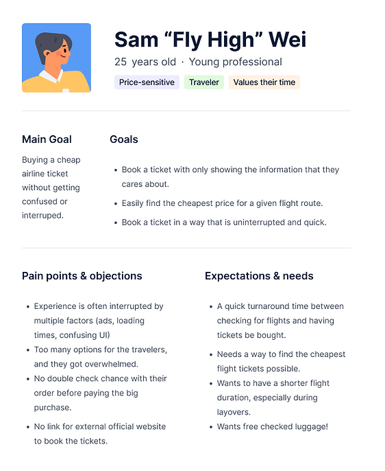
Based on the empathizing stage, we created a user persona to help us shape the user and look deeper to find their needs.
The persona includes: goals, motivations, attitudes, and frustrations about the user.
Journey Map
According to Sam's persona, we built out the journey map of user using Expedia to do a flight ticket purchase.

KEY PRINCIPLES
How-might we statement
Last, we come up with the How-might-we Statement to focus on the further solution.
-
How might we quickly show users the most relevant parts of the shopping experience so that they can interact with the information they value first?
-
How might we shape the website navigation so that the users feel empowered and in control when booking tickets?
-
How might we improve the user experience on more complex displays so that users don’t abandon their bookings?
NEXT STEP
#1 Deeper User Interviews.
People who have booking experience. v.s. People who DON’T have booking experience
This will allow us to further refine our persona and identify overlapping pain points among all users.
#2 Solution Brainstorming.
Move to the ideation part of the design thinking and brainstrom the solutions!
#3 Full prototype of Expedia’s page with elements changed.
For example, show users a scrambled version of Expedia where certain pages come up before others.


